most profitable crypto miningzcash review Challenge Insight SolutionNicktoons Rebrand
Action to The Maxion!
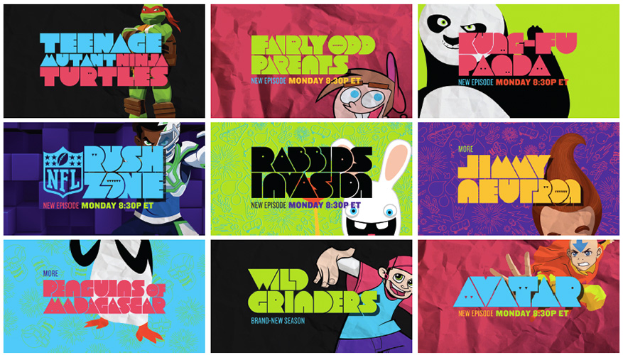
Nicktoons is where 9-11-year-old boys get their animation fix… or at least it was until competition and shifting viewing habits began eroding ratings. A brand refresh was needed to unite the various properties under one informing idea, providing a simple navigational system and a look that was unique yet tied back to the Nickelodeon mother brand.
Consumer insights yielded that our audience loved action and comedy in equal doses. Our informing tagline: “Action with a comic boom, laser-focused on boys” became the filter to evaluate all work.
We engaged Sibling Rivalry as our partner. Together with the illustrator and typographer Justin Harder and our crack in-house team we crafted a series of branding spots, network i.d.’s, and show i.d.’s that were unique, funny and irreverent. The functional tune-in pieces could be easily updated and formed the basis for a style that was easily translatable for any stunt across all platforms.
See another case study here